
![]()
Since 2006, streaming service Spotify has became one of the default platforms for music lovers to discover and store a humongous range of music. It was a miracle that came out of the blue and took over, yet it feels strange to be without it. The fact that its Swedish origins allow it to avoid an unbiased lean towards American and British acts provides a special service above local radio stations. It’s developed further into the ultimate music source with “browse” functions of the latest releases, randomized radio, artistic association or genre-specific gold digging. Aside from the annoyance of ironic advertisements that pop up unexpectedly for Spotify Free users, it’s been the music fanatic’s best friend.
However, in this modern era, life moves fast, changes are suddenly made and many companies don’t value the “if isn’t broke don’t fix it” idiom. This is the case with Spotify’s irrational new interface launched last week. A few months ago, it was perfect in its usability and aesthetic arrangement but two quick-succession design changes and it’s looking blander, more corporate and is becoming a musical equivalent of Facebook.
The main design change in the first alteration was the music feed. This useful application allows you to follow brands and trend-setting hipsters that know the hottest music light years before the average Joe. What was great about the design from 2014 was that the main icon showed the artwork of the song and its title with much more prominence than the listener’s ID. After all, the point of Spotify is the music and it proved that a colourful piece of intriguing artwork can attract clicks rather than a dull self-portrait. As an extension of the old-fashioned album sleeves, it helped define the personality of bands and commonly separated acts with vain egos and bands that want to express something more than their faces.
However, the new Spotify interface favours the irrelevant user ID photos and relegates the act’s name and specific song to a greyed out subtitle. The days of discovering a band through their artwork is disappearing rapidly. As disappointingly as it was, Spotify’s second successive new design is even more bizarre. Previously, the album cover would appear bright and beautiful as it was played, but now it’s so small that it defies a purpose and a magnifying glass needs to be on hand to view it. The album art is still visible when looking at new releases and it takes a dominance in the colourful nature of this features, but with the recent alterations, how long before that disappears too?
It’s just one of many aspects of the interface that Spotify has made smaller including shrinking the play bar – which evidently makes it easier to Spotify Free users to miss the action of stopping the song before the adverts shout through the speaker – the name of the song and the volume bar. Whilst unnecessarily large play, forward and rewind buttons outweigh the title which can easily be functioned with short hand keys. If only this was an Adobe program because you’d have the luxury of adjusting the size and specifications with handle bars.
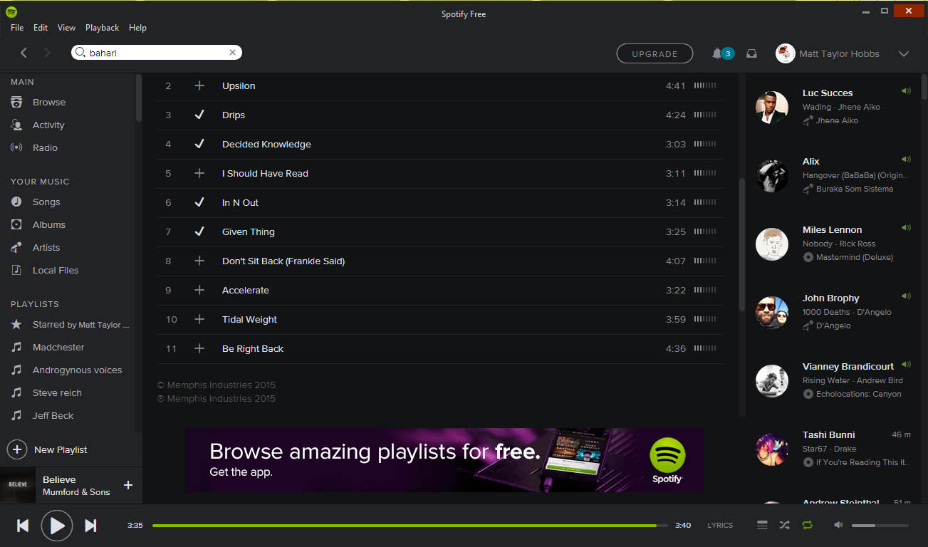
The last but not least design fault is the window of activity, which has been compressed to allow more flash-created adverts to loop endlessly in the face when the purpose for being there is to focus on the music. This can become especially tedious when viewing the entire track list of an album or your saved playlists which becomes a chore of epic scrolling. Which is a shame because Spotify improved on its scrolling visibility after the bar became so invisible, users had to guess where to click.
It seems as if they have forgotten the premise of the application and its ease of use in the hunger for copying current design trends: making text minuscule and creating an over-abundance of blank space. Even the Spotify logo’s small size looks freaky and requires squinting. If it’s so small, what is the point of it being there? Hopefully this is an experiment in design and a third interface change is eminent. Download Spotify here.
Words by Matt Hobbs // Edited by Ayo Adepoju